Restaurants often use red in their branding. Banks prefer blue. It’s because colors evoke emotions, feelings and, in some cases, nostalgia. Some colors are even associated with seemingly unrelated issues like increased metabolism, increased blood pressure, and eye strain.
It’s all because of color psychology. The colors you choose for your branding decisions will not only increase your product appeal but also assure you convey the message you want. Admittedly, much of the proof around this topic is anecdotal, but researchers have made some interesting discoveries about colors’ effects on moods and behaviors—which can help you make decisions the next time you’re in the midst of a rebrand or refresh.

Blue is a popular choice for banking institutions because it instills feelings of security and trust.
At the most basic level, colors are separated into warm and cool colors. Warm colors—like red, orange and yellow—can evoke emotions ranging from anger to warmth, from hostility to comfort, according to Verywell Mind, an online mental health resource. Cool colors—like blue, purple, and green—can evoke calmness, but also indifference or even sadness.
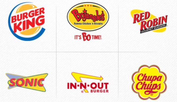
So how can colors help your business? Fast food brands like McDonald’s and Burger King use red in their logos and around their stores because it revs up people’s appetites. It’s said to increase circulation and stimulate the body, and the color can make customers more likely to enter the store and buy more food, according to Business Insider.
Source: creativepro.com
The colors that someone selects for personal items can even say something about their personality. Consider your color choices like your own personal branding. Our choices give insight into the image we want to reflect, according to VeryWell Mind, and factors like buyers’ age and gender can also affect their selections.
Consider these colors and the emotions associated with them the next time you’re making branding decisions around logos, business cards, and advertising—and keep in mind that, in some cases, colors can have contradictory associations:
- Green: peacefulness, happiness, relaxation, thoughts of nature and growth.
- White: purity, relaxation, security. White can feel clean and evoke youth and modernity.
- Black: elegance, rationality, stability. On the opposite side, the color can also evoke hopelessness and sorrow. It’s a powerful color, which is possibly why it’s the most popular selection for luxury cars. People call the color sexy, mysterious and even ominous.
- Dark blue: security, trust, safety. Choosing blue might indicate a person is dependable.
- Orange: vitality. It’s an energetic color, evoking excitement and enthusiasm. It’s meant to be attention-grabbing.
- Pink: tranquility, relaxation. On the opposite side, the color can also evoke fatigue.
- Red: boldness, energy, warmth, sensuality. It can project confidence and power and rev up people’s appetites. On the opposite side, the color can also evoke danger.
- Bright yellow: joy and optimism. Selecting yellow items likely means a person is happier than most—and maybe a little more likely to take risks than others.
- Silver: innovation, modernity. It’s the third most popular car color and often the color of high-tech products.
- Gray: neutrality and balance. Drivers of gray cars don’t want to stand out.
If you’ve got your brand colors chosen and are ready to get started, check out our full range of print and production offerings online. Need some help nailing down color combinations? Feel free to email us, reach out online, or call 260-748-0577. Our color and printing experts are happy to help.

